Graphic Design
In this course, you will be introduced to the Graphic design industry. You will create thumbnail sketches, rough development drawings, and comprehensive design plans, all of which are the building blocks of the design process. You will spend time learning the fundamentals of visual communication. This course will stress how the artist can communicate and create meaning through simple yet intentional visual manipulation (points, lines, planes, gestalt, and color). This course will cover the power of words through an examination of typography. You will learn to use typography as a communication tool— to make artful design choices and organize and communicate meaning. You will discover how type can be used to make text more readable, and how it can help organize content for ease of comprehension. You can access the Adobe Creative programs Photoshop, InDesign & Illustrator on your device. Topics covered will include; visual identity design, marketing & advertising design, publication design, packaging design, environmental graphic design, and art and illustration for graphic design.

HOW DO
GRAPHIC
DESIGNERS
WORK?
Step 1: Identify client needs
- Who is the target audience?
- What does the design need to communicate?
- What aesthetic will communicate this effectively?
Step 2: Find Inspiration
- Mood Board
- Similar Companies/Businesses/Brands
- Color Palette
Step 3: Define the Aesthetic
- Minimal/clean/simple/primitive
- Natural/”green”/eco-friendly/earthy
- Vintage/retro
- Warm/welcoming/cozy/comfortable/relaxed
- Playful/humorous/light-hearted
- Elaborate/fancy/ornate
- Punk/gritty/grunge
Step 4: Sketch
Step 5: Create
Keep in mind…
-
the first design won’t be “the one”
-
use the design process to create many variations and then narrow them down
-
sketched designs can be traced and recreated in Photoshop and Illustrator
Step 6: Present to Client
- Show multiple variations
- Review the goals of the design brief
- Client selects a design, may want changes
Step 7: Finish!
-
Adjust design to meet client needs
-
Give high-quality, original files to the client
Knowledge and Understanding Task 1. Types of Graphic Design
Read this article: 99Designs 8 you need to know


Graphic Designers
Capture the Beauty
they're the artists
The four main business objectives are economic,
social (customer relations), human (internal employee well being), and organic (development - for example, growth models)
Marketing goals and objectives are to...
-Improve brand reputation
- Improve brand presence
- Improve website traffic
- Improve conversion rate
- Increase reviews
- Increase revenue
- Increase project margins
Marketers use advertising.
In advertising, the ultimate objective is the sale of goods and services.
In graphic design, "the essence is to give order to information, form to ideas, expression, and feeling to artifacts that document human experience."


Modern Graphic Designers
20-21st Century
Jonathan Barnbrook
Saul Bass
Herbert Bayer
Michael Bierut
Neville Brody
David Carson
Carolyn Davidson
Alexander Dux
Alan Fletcher
Milton Glaser
Rob Janoff
Susan Kare
Chip Kidd
Linden Leader
George Lois
Herb Lubalin
Alvin Lustig
Max Miedinger
Aries Moross
Joseph Muller-Brockmann
Morag Myerscough
Stefan Stagmeister
Paul Rand
Paula Scher
Peter Saville
Massimo Vignelli
Task 2 Directions: Use Google to find images of artists’ work from the list above. (For best results, find the artist’s official website portfolio). Copy this Google doc. and save it in your Graphic Design folder, title it 'Modern Graphic Designers'. Choose 5 artists whose work you like. Choose 1 work per. artist, and copy and paste an image of their work onto the doc. Lastly, in complete sentences, explain what impressed you about their work and/or what they are well known for.


The building blocks
Objective: HERE you will view examples and learn about how the elements of art and principles of design are used to create effective pieces of design.
Task 3
Graphic Design Components Analysis: Imagery, Typography, Color, and Layout
DIRECTIONS:
-
Find a piece of design that... 1) you like and 2) includes all of the components.
-
Copy this document and place your work into your design folder.
-
Explain why you think the design is effective in a paragraph (at least 5 complete sentences!).
-
How does the design communicate its intended purpose?
-
Why/how did the design catch your eye?
-
To help you identify what is good design, it is useful to know what is BAD design
T Y P O G R A P H Y
*Some* Important Vocabulary
Size
Cap Height: The height of a capital letter
X-Height: The height of a lowercase letter
Hierarchy: Changing the size of the text to emphasize what is most important or what should be seen first
Point: Measurement of font
Weight: The thickness of letter strokes
Spacing
Leading: The space in between lines of text (pronounced like what is at the tip of your pencil)
Kerning: The space between characters - A V & AV
Tracking: Spacing between letters of a word - T r a c k i n g
Alignment: Where the words are “flushed” to, or start (this document is aligned to the left)
Letter Components & Labels
Ascender: The part of a lowercase letter that stretches above the x-height - the top of b, d, h, t
Arc: The curved part of a letter
Bar: The horizontal stroke in a letter
Baseline: The imaginary line that the font sits on
Counter: The enclosed or nearly enclosed space of a letter - b, c, d, e, g, o, p, q, etc.
Crotch: The narrow space where angled strokes meet
Descender: Part of a letter that falls below the baseline - the bottom of the letters g, j, p,q, y
Serif: The “flare” at the end of the letter’s strokes
Stroke: The lines that create the letter
Title: The ridiculous name for the dot above lowercase i & j
Style
Display: “Fancy,” used in titles or headings, used sparingly
Script: Handwriting or cursive style
Serif: “Flares” on the end of letters, feels classy - Times New Roman
Sans Serif: Without serif, straight end caps, no flares, easiest to read - Helvetica
To be specific:
Glyph: Design of an individual letter
Character: Individual letter, number, or punctuation
Typeface: A design of type
Font: The file that contains a typeface, a finished typeface
Family: Closely-related font
Typography. Task 1. - Make a copy of this document and save it in your Graphic Design folder. This task's objective is for you to demonstrate an understanding of the appropriate use of fonts.
Typography Task 2. Typography Composition Assignment
Objectives: To reconsider how you view a glyph(s). To create a piece of digital abstract art
Typography Task 3. Client Brief.
Ruth Powers
Rosie-the-riveter type. Owns a mechanics shop.
Brief: needs a new logo for her business ‘Kind of a Big Wheel’
Graphic Design Emphasis: Typography: Scale & Tension - Squish and Separate;. Composition. Type on a path

Color Theory
In Color Theory, a color scheme is the choice of colors used in design for a range of media.
Color schemes are used to create style and appeal.
Color schemes contain a full range of values (tints, tones, and shades) of each hue.


Color Task 1. Classic Color Schemes

Color Task 2. Intuitive Color Schemes
Color Project Brief
Client: Kent Brockman
Profile: Grumpy, self-centered, pompous news anchor. Wears brown suit. Wants to impress his colleagues by organizing the Christmas party.
Brief: Design an invitation for the Channel 6 TV Station’s Christmas party
When: December 20th
Time: 6-late
Where: Springfield’s Grand Hotel Ballroom
Graphic Design Emphasis: Color Value / Saturation / Tint


The next step is to open Adobe Express
Here you can pre-browse Christmas Invitations and edit one to suit. If you don't like any, then feel free to create your own in Ai (illustrator) or Ps (photoshop). Alternatively, you could start it using the templates in Adobe Express and then finish it in another program.
You must implement your chosen color palette and be able to say which color theory swatch best describes your Christmas invitation. Add that information to the title when you save it as a jpeg, and put it into your graphic design folder.


RESUME REQUIREMENTS AND INSTRUCTIONS.
YOUR RESUME MUST:
-
Reflect the job/career you want in the future
-
Resume design should reflect that industry
-
The job should be referenced in objective or with relevant skills
-
-
Reflect understanding of layout
-
Name and contact info. at the top of the page
-
-
Reflect understanding of the purpose of a resume
-
Reverse chronological order
-
Quantify skills
-
Proper grammar, punctuation, and capitalization
-
Full page
-
-
INCLUDE:
-
Name
-
Contact info
-
Introduction (summarize resume) - OR - Objective (explain what job you are looking for)
-
Education
-
Work Experience (include volunteering)
-
Awards & scholarships
-
YOUR RESUME CAN:
-
Include a monogram or design element
-
Include high school graduation accomplishments
-
Include GPA
-
Include a skills section
-
Include references
YOU CAN CHOOSE:
-
Program to create a resume
-
Word
-
Canva
-
Photoshop
-
Publisher
-
Adobe InDesign
-
-
Layout/Organization
-
Order of education and experience sections
-
Placement of designs/shapes
-
Font(s)
-
Colors
-
HOW TO WRITE YOUR RESUME.
-
Name and Contact Information
-
Top of page
-
Name should be large and obvious
-
Contact info:
-
Phone number (can put a fake number)
-
Email
-
Town/City
-
-
-
Introduction
-
Should be at top of page
-
Do not write in 1st person, or refer to yourself by name
-
Give yourself a title:
-
“A college graduate with experience in…”
-
“A professional…”
-
“An experienced…”
-
-
-
Summarize skills and experience that will be included later in the resume
-
Make general, overarching statements based on experience and skills
-
Keep it short - not more than 3 sentences
-
-
Work Experience (can be before or after education)
-
Reverse chronological order
-
Most recent experience first, oldest listed last
-
Include date range worked (format: month year - month year)
-
Example: Das Dutchman Essenhaus -- August 2018 - January 2019
-
Example: Middlebury Community Schools -- 2017 - Present
-
-
-
Responsibilities and accomplishments at that job (listed under job title)
-
Write a past-tense, shortened statement - not a full sentence
-
Start each statement with a strong verb
-
Example: “Responsible for daily duties of…”
-
Example: “Lead a team of people to....”
-
Example: “Accomplished…”
-
DO NOT REPEAT VERBS
-
-
-
All jobs must have same number of responsibilities/accomplishments listed
-
All responsibilities and accomplishments should be specific and measurable
-
-
-
Education (can be before or after work experience)
-
Reverse chronological order (most recent first, list Northridge High School)
-
Optional: can list middle school or college
-
Include dates attended high school (August 201* - May 20**)
-
-
School Activities (list under each school)
-
Clubs, sports, choir, band, mentor, etc.
-
Include recognition/accomplishments for each extracurricular (if applicable)
-
-
-
Skills (optional)
-
Only include if you have additional skills that haven’t fallen under work and education
-
Skill section should be near the bottom of the page
-
QUANTIFY SKILLS - BE SPECIFIC
-
Bad Example: “Leadership”
-
Good Example: “Lead a team of coworkers in department reset.”
-
Bad Example: “Presentation Skills”
-
Good Example: “Experience preparing Powerpoint presentations and speaking in front of groups of 25+ people.”
-
-
Objective: To identify brands with which you are familiar with, and consider how
a brand’s appearance influences public perceptions


B R A N D I N G A N A L Y S I S
Directions: Think of companies/businesses/brands you like, have heard of, or would like to know more about. You will need a total of 4 different brands. You will make a copy of, and complete, the Branding Slides Template. For each brand, find 2 photos that feature a different aspect of that brand (see list below for ideas). You will also write your description/analysis of the brand - what do the branding choices communicate?
Branding Components that could be included in photos:
-
Logo
-
Website header
-
Fonts
-
Color Scheme
-
Magazine Advertisements
-
Website Ads
-
Package Design
-
Label Design

Name of Company
Photo of Logo
&
Magazine Ad
Description of what their branding choices communicate about their company.
IMAGERY
Imagery can both enhance the user experience and express a brand's visual language. Images help tell a story, clarify complex messages that are difficult to express with words, and to show users how to perform an action.

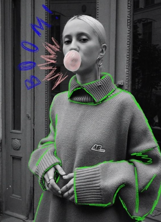
Task 1. Using the cameras in the Photo Lab, or your camera phone, you are going to capture an image of a friend from the waist up, so this will be a mid-to close-range shot.
The most important thing is that it's in focus.
Take your best shot and 'open' it in Photoshop. Then you will go to image - desaturate - black and white.
Create a new layer - go to your paintbrush tool. Select a color and appropriate brush size and begin to draw on top of your photos like the example image.
You are aiming to EMPATHIZE parts of the image with color and mark-making.
What is Notan?
Task 2: aim to create a couple of Notan in your process journal (or on the individual white paper sheets in the classroom). You are aiming to have as much black paper flipped out of the square, as is left inside the square, to achieve BALANCE.


Similarity
Proximity
Continuity
Closure
Figure/ground
Simplicity
Familiarity


Task 3. Demonstrate gestalt principles depicting a fruit or an animal


Student example works


With your parent's permission: you could create an AI-generated image of your symbol using Leonardo,
Use very specific prompt descriptions of your animal or fruit symbols. For example: "2D symbol of a fox jumping, for logo use, using orange, black and white".

Client - Greenhills School Yearbook
Greenhills graphic design students, your artistic prowess is invited to enhance this year's Yearbook! As a celebration of our vibrant student community, your contribution will be instrumental in creating a visual tapestry that truly reflects the essence of our school. Your involvement is not just appreciated; it is invaluable!


This year's theme:
Oh, the Places We've Been!


Overview
This project challenges you to bring the imaginative world of Dr. Seuss into the visual identity of our school yearbook. You’ll brainstorm and design original imagery, patterns, and typography inspired by the theme “Oh, the Places You’ll Go!” all while tying in our school mascot, the gryphon, in creative and unexpected ways.
You’ll use Adobe Illustrator to develop your ideas through short design challenges, building toward a final yearbook cover concept.
Creature Construction Challenge
Focus: Using shape tools creatively
You’ll start by reimagining our school mascot, the gryphon, as if it lived in a Dr. Seuss book.
-
Use the Shape Builder Tool in Illustrator to construct a hybrid creature inspired by both a gryphon and an imaginary Seussian animal.
-
Think about playful proportions, flowing shapes, and personality.
-
Use only the given yearbook color palette to start exploring color relationships.
Whimsical Worlds & Shape Language
Focus: Composition and visual vocabulary
Goal: Develop a visual vocabulary of shapes that might appear in your final design.
Dr. Seuss’s worlds are full of rhythm, pattern, and movement. Today, you’ll explore that visual language.
-
Start by sketching three small thumbnails of imaginary landscapes. Think curling paths, floating stairs, bouncy hills, or looping roads.
-
Choose your favorite and rebuild it digitally in Illustrator using flat color shapes and the Pen Tool or Blob Brush Tool.
-
Focus on balance, flow, and simplicity.
Pattern Play ~ Pathways & Whimsy
Focus: Creating repeating motifs
Goal: Develop a pattern that could work as a background, endpaper, or border in the yearbook design.
Patterns are a huge part of Seussian design; they bring rhythm and energy to a page.
-
Create a repeating pattern in Illustrator using shapes or motifs inspired by your previous work: swirls, stripes, clouds, or stairs.
-
Use the Pattern Options panel to test and refine your repeat.
-
Keep your color palette consistent.
Color & Typography Mini-Challenge
Focus: Color consistency and playful type
Goal: Learn how color and type work together to express emotion and personality.
Part 1 Color Challenge:
Using the yearbook palette, create three mini compositions (squares or circles) that express different moods through color alone, no outlines, just flat shapes.
Part 2 Typography Challenge:
Design a playful title treatment for “Oh the Places We've Been!”
Experiment with hand lettering or type manipulation. Seussian text should feel alive and full of movement!
Build-a-World Collaboration
Focus: Teamwork and composition
Goal: Learn how color and type work together to express emotion and personality
You’ll combine elements from everyone’s work: creatures, landscapes, and patterns, to design a collaborative Seussian world.
-
Work in small groups on a shared Illustrator artboard.
-
Arrange your elements into one cohesive scene that celebrates imagination, adventure, and the spirit of Greenhills.
-
Think about layering, hierarchy, and storytelling.
Final Cover Design Sprint
Focus: Integrating design elements into a unified concept
Using your previous work as inspiration, you’ll design a concept for the yearbook cover.
-
Include your Seussian gryphon, a creative landscape, and your typography treatment.
-
Consider layout, balance, and how the imagery will wrap around the front, back, and spine.
-
You may incorporate patterns as background textures or borders.
-
The Spine must read Greenhills School Forward Yearbook 25-26
Deliverable: One fully developed cover concept, presented as a digital mockup.
Critique & Selection
You’ll share your cover designs in a group critique.
We’ll discuss:
-
How effectively your design captures the Oh, the Places We've Been spirit
-
How you incorporated our school identity and color palette
-
How creative and original your visual solutions are
Some designs (or parts of them) may be selected for the final yearbook design!

Business Start-up
Branding Project
Objective:
You will develop a complete brand identity for a start-up business concept of your creation. This project will challenge you to think like entrepreneurs and graphic designers, blending creativity, strategy, and technical skills to communicate visually with a target audience.
This project is a chance to explore branding and visual communication while expressing your individuality as a designer. Push your creativity and consider how your designs would resonate in the real world!
Project Requirements
-
Business Concept
-
Choose a start-up idea (e.g., a café, clothing brand, app, non-profit organization, etc.).
-
Write a short description of your business, including its mission, values, and primary products/services.
-
Define the target audience:
-
Demographics (age, gender, income level, etc.)
-
Psychographics (interests, values, habits, etc.)
-
-
-
Brand Style Guide
-
Logo:
-
Create a simple, recognizable logo representing your start-up’s personality.
-
Provide one black-and-white version and one full-color version.
-
-
Color Palette:
-
Select 3–5 colors that represent your brand. Include hex codes or RGB/CMYK values.
-
-
Typography:
-
Choose fonts for:
-
Website headers
-
Body text
-
Advertising signage
-
-
Explain why these fonts fit your brand’s tone.
-
-
-
Imagery
-
Develop a style for the imagery associated with your brand:
-
Photos
-
Illustrations
-
Patterns or icons
-
-
Include at least 3 examples that could be used in promotional materials (mock-ups or original work).
-
-
Promotional Piece Design
-
Design one promotional material:
-
Examples: Business card, flyer, social media post, website homepage mock-up, or product packaging.
-
Ensure the design is cohesive with your brand’s style guide.
-
-
Timeline
-
Week 1:
-
Research the target audience and inspiration for branding.
-
Select a color palette and typography.
-
Week 2
-
Finalize brand style guide (logo, colors, typography, imagery).
-
Start designing the promotional piece.
-
Complete the promotional piece.
-
Prepare a 5-minute presentation for a mock "pitch" of your brand.
-
-
Deliverables
-
Written Description of the business concept and target audience. (1 page).
-
Brand Style Guide: Logo, color palette, typography, and sample imagery.
-
Promotional Piece: One complete design demonstrating your brand identity.
-
Presentation: A concise visual pitch showcasing the brand identity and explaining the creative choices.
Evaluation Criteria
-
Creativity: Originality and uniqueness of the business concept and branding.
-
Consistency: How well the brand elements (logo, colors, typography, imagery) work together.
-
Design Execution: Attention to detail, technical skill, and overall aesthetic quality.
-
Target Audience Alignment: Effectiveness in appealing to the intended audience.
-
Presentation: Clarity and professionalism in communicating your brand concept and designs


